
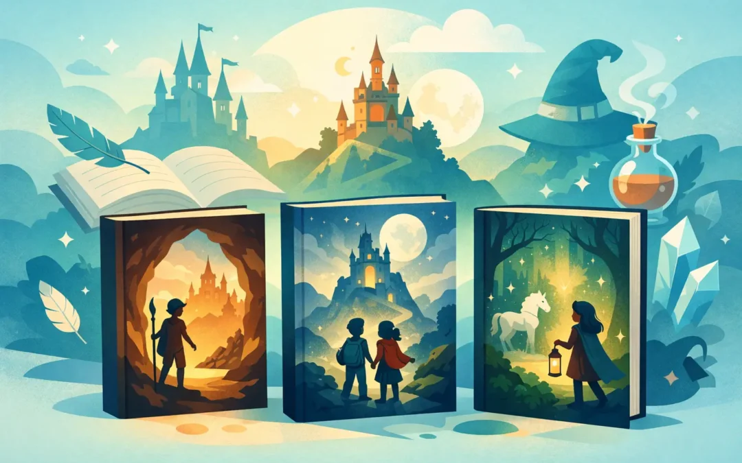
A child can walk past a hundred books and stop cold at one cover. That pause matters. In a crowded classroom library, a school book fair, or a quiet trip to the public library, middle grade fantasy book covers often make the first promise a story gives: there is wonder here, and it is meant for you.
For readers ages 8 to 12, a cover does more than look pretty. It signals tone, age range, emotional stakes, and the kind of adventure waiting inside. For the adults who help place books into young hands, it also hints at quality, care, and whether the story will meet children where they are. The best covers do both at once. They invite curiosity while building trust.
Why middle grade fantasy book covers matter so much
Middle grade readers are wonderfully honest. If a cover feels too young, they move on. If it feels too dark, too busy, or too much like a teen novel, they notice that too. They are looking for excitement, but they are also looking for themselves – for bravery that still feels believable, magic that brushes up against everyday life, and a story world they can step into without getting lost.
That makes this category especially interesting. Fantasy opens the door to impossible things, but middle grade keeps one foot on the ground. The strongest covers understand that balance. They offer enchantment without becoming abstract, and they suggest danger without becoming grim.
For parents, teachers, and librarians, the cover is often the first quick clue about suitability. Is this a playful adventure? A spooky mystery? A heartfelt story with magical elements and real emotional depth? A thoughtful cover helps answer those questions before the first page is turned.
The visual language of middle grade fantasy book covers
There is no single formula, and that is a good thing. Still, certain choices appear again and again because they speak clearly to this audience.
Color sets the emotional temperature
Color is one of the fastest storytellers on a cover. Deep blues, glowing golds, emerald greens, and rich purples often suggest mystery, magic, and nighttime adventure. Brighter palettes can signal humor, hope, or a lighter fantasy tone. Muted tones may point toward a more reflective story, especially one rooted in real-world challenges.
What matters is not simply whether a cover is bright or dark. It is whether the color feels emotionally honest. A whimsical story can carry shadows. A serious story can still shine. Young readers respond to that emotional clarity, even if they do not put it into those exact words.
Characters create instant connection
Many effective middle grade fantasy covers feature a child protagonist front and center, or at least clearly present within the scene. That choice gives readers someone to follow before they know the plot. It says, this is your guide. Come with them.
When a character appears on the cover, expression and posture matter. A brave stance can suggest action. A thoughtful look can hint at mystery or inner conflict. If the art captures vulnerability as well as courage, it often feels especially strong for middle grade, where emotional growth is just as important as external adventure.
Setting and symbols build intrigue
A lantern in a dark hall, a key glowing in a pocket, books swirling with light, a hidden doorway, a moonlit forest – fantasy covers often rely on a few carefully chosen visual clues rather than trying to explain everything at once. That restraint is part of the magic.
Children like having room to wonder. Adults appreciate when the imagery feels purposeful rather than cluttered. The best covers leave a question hanging in the air: What is happening here, and why do I want to know more?
What makes a cover feel truly middle grade
One of the hardest things in publishing is hitting the right age signal. A cover can be beautiful and still miss the mark if it reads as chapter book, young adult, or adult fantasy.
Middle grade usually lives in a visual middle space. The typography tends to be clear and expressive rather than severe or overly ornate. The imagery often has movement, immediacy, and emotional warmth. Even when the story includes danger or grief, the cover usually leaves room for hope.
That hopeful quality matters. Many children in this age group are ready for big feelings and real stakes, but they do not want to feel shut out by heaviness. A strong middle grade fantasy cover says, this story may challenge you, but it will carry you.
Covers that promise more than magic
Fantasy has always been a wonderful home for deeper truths. A child facing loneliness, instability, self-doubt, or change may find those experiences reflected through spells, secret worlds, and impossible quests. When a cover quietly holds both wonder and weight, it can be especially powerful.
This is where nuance matters. A cover for a story with emotional realism should not hide that depth completely, but it should not flatten the book into seriousness either. The visual promise should feel balanced. Wonder can sit beside hardship. Beauty can exist alongside uncertainty.
For books that explore friendship, resilience, belonging, or family struggle through a magical lens, the most memorable covers often suggest both the dream and the heartache. That combination helps the right readers find the book – and helps adults recognize that the story may open meaningful conversations.
Trends can help, but they are not the same as timelessness
Publishing always has visual trends. At one moment, silhouetted figures may dominate. At another, hand-lettered titles or highly detailed illustrated scenes may feel everywhere. Paying attention to trends can help a book look current, but chasing them too closely can also date a cover quickly.
Timeless middle grade fantasy book covers usually do something simpler. They know exactly what feeling they want to leave behind. Maybe it is wonder. Maybe it is courage. Maybe it is the hush before a secret is revealed. If that feeling lands, the cover has a much better chance of lasting beyond the season.
This is one reason illustrated covers continue to work so well in middle grade. Illustration can hold realism and imagination in the same frame. It can soften difficult themes while keeping them visible. It can also create a distinct personality that photography often struggles to achieve for fantasy in this age group.
What adults notice that kids may not name
Young readers often choose instinctively. Adults tend to read the same cover differently. They notice whether it looks professionally made, whether the design seems thoughtful, and whether the promise of the cover matches the values they want in a book.
That does not mean adults and children want opposite things. In many cases, they are responding to the same strengths. A cover that feels emotionally true, visually inviting, and age-appropriate works across both audiences. The child sees adventure. The adult sees care. Both are important.
For educators and librarians in particular, covers can shape recommendation confidence. A strong cover suggests that the reading experience has been crafted with intention. It signals that this book understands its audience and respects them.
Why the best covers linger in memory
Think about the middle grade fantasy covers you remember years later. Chances are, they did not only show a magical object or a dramatic scene. They captured a feeling that stayed with you. A little loneliness. A spark of courage. The thrill of stepping toward the unknown.
That is what great design can do. It gives a story a face before the first chapter begins. It creates a quiet emotional bond between the book and the reader. And for children especially, that first bond can be the difference between a book that stays on the shelf and a book that gets carried everywhere.
A story like The Book Witch lives in that tender, enchanted space where books, magic, and hard-earned hope meet. Covers for stories like this have a special job. They need to whisper adventure while making room for heart.
The most effective middle grade fantasy cover is not the loudest one in the room. It is the one that makes a child feel seen, makes an adult feel confident, and makes both of them want to open the book and begin.